Description:
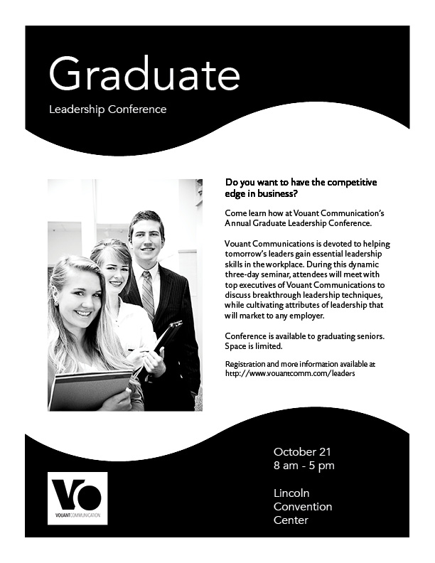
Black and White flier to advertise a graduate leadership conference by Vouant Communications.
Process:
The first thing I did was sketch out four different layouts, or formulate a plan. I picked the one I thought was best and developed it more to include more details and better organization. I then created the layout in Adobe InDesign. I created a wave on the top of the flier and filled it with black. For repetition, I copied and pasted the shape and put it at the bottom of the flier. That also gives my flier some rhythm. With the black shapes, I was able to create a hierarchy to show the importance of the title, then the text, and lastly, the logo. To make the title stand out, I made it contrast black shape by using white text. I aligned the logo with the title at the bottom of the flier to create an orderly layout. There is plenty of white space around the image and body text to make things look neat. The image, logo, and text were provided. I corrected some of the grammatical errors and chose and image that drew attention to the focus of the flier.
Message:
I wanted to convey the idea that the conference will help the graduates be more professional and marketable in their search for a job. The message was for them to see that the conference will “get them a cutting edge in business.”
Audience:
I was gearing towards those who have just graduated college. I went for a younger audience about 22-30. I put the waved border to appeal more to younger people, but still look professional.
Top think I learned:
This was the first time that I have ever even opened InDesign so everything was new. It was great to learn the importance of alignment and white space. I did not know what white space was but it made sense as soon as I heard it. Now that I know what it is, look for it, and see where there needs to be more.
Title Font Name and Category:
Avenire: Sans Serif
Copy Font Name and Category:
DTL Documenta Sans ST: Sans Serif
Links to all images used in this project:
1. https://130.commbyui.org/wp-content/uploads/2013/01/VouantLogo2.png

I think that your flier is very well done. I like how you stepped out of the box and added some curved shapes in your flier. I think you did very well with contrasting your elements. The only critique I have is that I think you could have chosen two fonts that contrasted each other more, they look very similar.
Here is a link back to my blog. https://kmanderson4.wordpress.com/category/design/
LikeLike
Your Design is very refreshing! I really like the wavy effect you have given it with the black shapes. I really feel that it makes it very interesting and engaging to look at. I also Like the simplicity it has, it is not too packed with unnecessary elements that would distract the viewer too much. I also feel that the fonts you picked are great and go very well with each other. I love your hierarchy. You can clearly distinct the title, from the text and also the D-T-L. I love that you were able to achieve that. A couple of suggestion would be to try to create more contrast in your text. For instance, something I tried was to change the title graduate to lowercase and leadership and conference in capital. Also you can enlarge some words that you may want to emphasize, such as “Space is limited” you could make it bold, or increase the size. Everything else look great! good job.
Here is a link to another student’s project that I really liked:
LikeLike
I really like your flier! I love how you used the curvy lines. Also you did a great job using white space. I like the contrast you used with the white letters on the black background. Your flier caught my eye when it was displayed in class.
you can checkout my flier at:
https://toddandersoncomm.wordpress.com/
LikeLike
Brian, I think you have a really strong design here. I am kept in the design as a reader by the top and bottom wave design. It is fun for those in high school, yet still maintains a professional appearance. Inverting the logo was a good idea! There is only one thing that bugs me a little but it is really nit-picky. the text on the bottom feels a little too low. I think if you moved it up, it would help keep my eyes on the page better. Otherwise, great project!
LikeLike