Description:
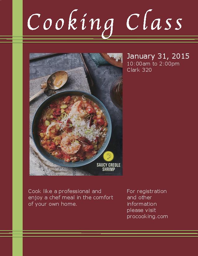
A color full-bleed event advertisement to promote a cooking class. This advertisement was created using Microsoft Word and a scanner.
Process (Programs, Tools, Skills, FOCUS principles):
First, I scanned an image of the Saucy Creole Shrimp from a magazine. In Word, I designed a layout that would match the scanned magazine picture. The entire picture was used just as it was scanned. It had rich color and a warm feel to it. I added the title and body text with text boxes. To create the lines at the top and bottom, I drew one straight line and copied and pasted it twice. Then I grouped the three lines and copied and pasted them to put a new set at the bottom. That was done to create repetition within the project. I put the picture in the middle because I wanted it to be the main focal point. The title text was enlarged to also call attention. I picked a color scheme of red and green because it felt warm and spicy. The programs used in the project were Microsoft Word, Cannon Scanner, and a PDF Converter PDF2JPG.net.
Message:
The message was that there was a cooking class that could help people make good food in their own homes. I wanted to relay the message that cooking is a skill that needs to be developed.
Audience:
My audience was people who love to eat good food and want to try to make it themselves. I geared it towards people who like to eat at home.
Color scheme and color names:
Complementary: red and green. These colors are best used together when the shade is varied, which can be seen in this advertisement.
Top Thing Learned:
I learned that Microsoft Word is a powerful designing tool. This was my first experience with the Publishing view and I was shocked at how many editing options there were. This was a great project to be able to discover the abilities and opportunities found it Word.
Title Font Name & Category:
Apple Chancery: Script
Copy Font Name & Category:
Verdana: Sans Serif
Scanned images used, sources, original sizes, location of scanner used:
The original image was scanned from Good Housekeeping Vol. 260 No. 2. 2014. Its original size was 8 and 1/2 inches by 11 inches. I scanned it at 2550 × 3300 pixels, and sized it to with 300 pixels/inch. The scanner I used was a CanoScan LiDE 700F. It is located on the first floor of the McKay Library.


I really like the script font you used for your title! The repetition from the groups of 3 parallel lines, and then the large perpendicular line gave good contrast and a sturdy look. I feel like the “registration and other information” could’ve looked better right underneath the day and time, and the “cook like a professional” part should’ve been bolded or a little larger to make it stand out. But the picture and colors capture attention very well, and they are definitely perfect for the audience.
Here’s my blog. 🙂
https://annjeaphotography.wordpress.com/
And maybe another blog you might want to check out.
LikeLike
Brian, I really like your event ad. I love your color scheme- I think it works really well with your subject! Nice use of the frame around the side and the top. Also, I really like the font you used in your title. It just fits all around nicely with the layout of your design. I can tell you really focused on alignment in this, as well.
Check out my design!
LikeLike
Hey Brian! I really like your ad! I like how you framed your picture and text with those green boxes. I also like the font you used for your title. I think it fits the message nicely! You should check out Andrew Pincock’s event ad. Its pretty awesome. https://andrewcomm130.wordpress.com/2015/01/30/project-2-event-ad/comment-page-1/#comment-8
LikeLike
I really like how you used dark colors yet they are really easy on the eyes, they really work well for your ad. It speaks out really well to your audience, it catches the eye
well. I also like how used the lines to accent your ad. I think you would enjoy Alex Richey’s blog http://xfactorutah.com/2015/02/event-ad-comm-130/.
LikeLike